News
It’s a “Rebrand New Day” at New York Tech
September 26, 2019
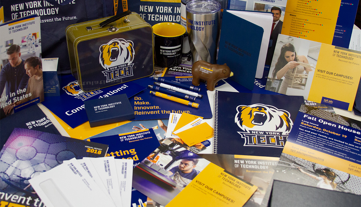
Renewed momentum and vision of the new New York Institute of Technology are being unveiled in a powerful brand identity that celebrates the 65-year-old university’s unique attributes and strengths, and a nod to its tech roots. The brand evokes the forward-moving direction that President Hank Foley, Ph.D., set for our university’s future.
The new tagline, “Do. Make. Innovate. Reinvent the Future,” echoes the President’s vision, aptly evoking the “maker, doer” spirit at New York Institute of Technology’s campuses in Long Island, New York City, Vancouver, and Jonesboro, Ark. The powerful “action” verbs are being integrated into university communications—ranging from marketing materials and advertising, to signage and promo items—to describe the ethos of all members of the New York Tech community and the exciting student experiences that await inside and outside the classroom.
As President Foley has reiterated, “We are bold thinkers, who dare to do what’s challenging, embracing our ability to make a path for others to follow and innovate where there is both obstacle and opportunity. Together, we will reinvent the future.”
The rebranding initiative was done by the Office of Strategic Communications and External Affairs’ creative and messaging teams in partnership with the Cedar Rapids, Iowa-based educational consultant Stamats. It encompassed more than 18 months of research, feedback, analysis, and testing, followed by adoption across many platforms in sharing our compelling story to internal and external audiences. The resulting brand creative reflects the energy and vibrancy of the change brought forth during the first two years of President Foley’s tenure. The brand launch included information sessions to all stakeholders, guidelines for visual and editorial products, a new brand video, and a range of digital and print assets that integrate the new brand into products including admissions materials, the institutional website, signage, ads, social media, promotional items, and a DIY toolkit for internal users.
Visually, the university colors were the first part of the rebranding process, changed earlier in 2019 to reflect the official state colors of New York—underscoring the university’s critical location and strength as an asset to students, faculty, staff, alumni, and the community at large.
“This bold new identity beautifully conveys who we are as a university and a community, positioning us well as we expand our reputation as the go-to place for undergraduate and graduate students to get an outstanding forward-thinking, career-oriented, technology-infused education,” said Nada Maria Anid, Ph.D., vice president for strategic communications and external affairs. “We are excited to integrate this vibrant new brand into our institutional framework as we continue to tell the New York Tech story and live the brand.”
Other new messaging includes a reintroduction of “New York Tech” as a secondary shorthand reference for the established “New York Institute of Technology” moniker. “New York Tech” has been fully adopted this year by our athletics department, which also introduced a new bear mascot, Roary, at Homecoming and Family Weekend on September 21.
New visual elements include proprietary typefaces, including Kuunari, Clio, DIN Next, and Arno Pro, that reflect the university’s contemporary and powerful forward-thinking technological identity. The new logo, utilizing the Kuunari font and featuring the blue/gold brand colors, includes an anchor bar above the full name of the university, and is flexible in its design to allow for lockups with school, department, and center names.


